Honorable mentions, in no order:
Luxun's nice monochrome treatment:

Alain's photo is well crafted, though I might wish for less foreground...
A cool image from John Medlin:

Markus continues the theme:
Steve Maz's nice contrast, colors, and curves:
Extra points to Pawel for a creative angle:
Peter's eye-catching colors and contrast:

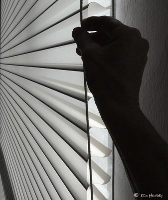
Flo Hendry has an unusual take:
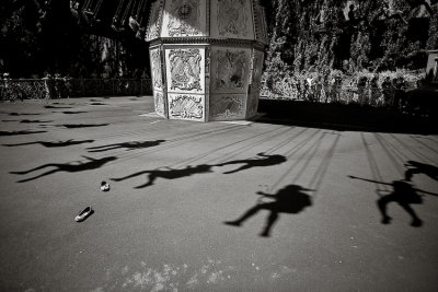
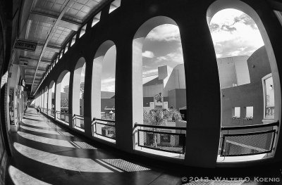
Third Place: I have been a sucker for MC Escher views ever since my mid-teen years (looking at Escher's drawings with headphones while listening to Traffic, Yes, or Led Zeppelin). Kudos to Walter for bringing me back there so expertly!
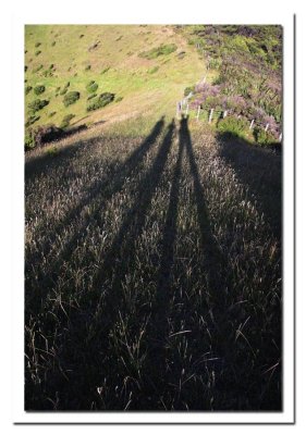
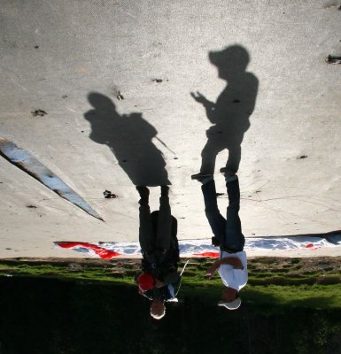
Second place: This image from Alla Gilbourd is not only pleasing to the eye, but also has the shadow as metaphor of the child growing into an adult.

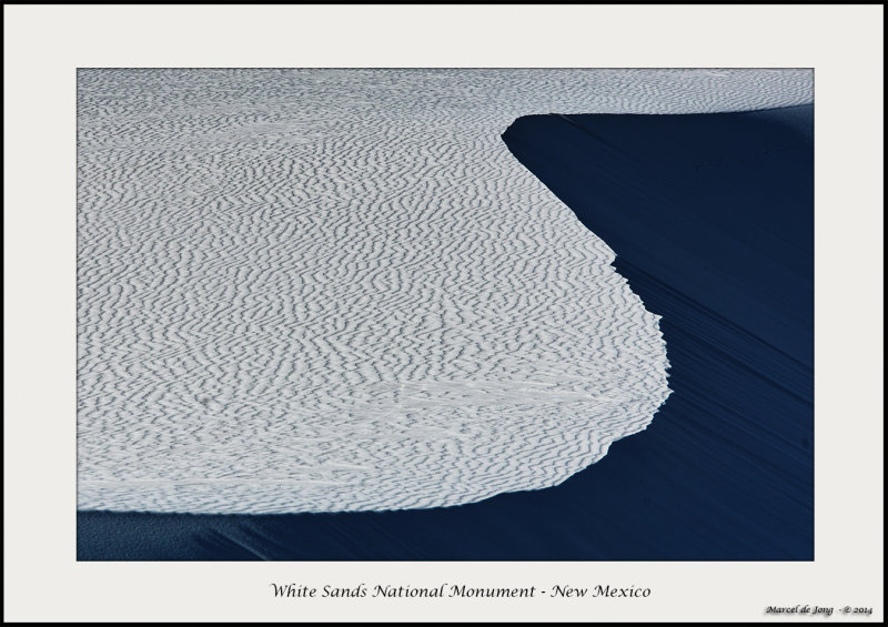
First place: The ultimate in simplicity, design, and grace. Every line in the image is made from a shadow. Congratulations Marcel, you win this one!