Page 1 of 1

Too much post processing?

PostPosted: Sat Jun 02, 2007 1:48 pm
by billinchapelhill
This shot is a big favorite of mine right now and I thought it would be quite popular but not so far. Due to the long night time exposure under heavy yeloow street lighting, the original was heavily monochrome and dominated by dull yellows. So I did much more color correction and painting than is my norm. The result is that the PP is much more obvious and I ask you if you feel that it is too much.

Image
http://www.pbase.com/billinchapelhill/image/79687141

For comparison here is the pre processed version
Image
http://www.pbase.com/billinchapelhill/image/79814471

PostPosted: Sat Jun 02, 2007 4:51 pm
by djwixx
Personally I prefer the original version, as it looks a bit more natural - to me. I suspect there are many people who enjoy photographs and are a little put off by what becomes photoshop art and not photography. I know I can be, but that's just my opinion.

PostPosted: Sat Jun 02, 2007 7:03 pm
by michaelsv
I agree with Dave, I almost like original version. Yes it has some cast, but on PP version the colors scheme is cooler and hence less attractive. May be to get another pass on the original image and just try slightly run some automatic color correction (ACR?) and see what is happening.

Just IMO,
Michael.

PostPosted: Sat Jun 02, 2007 8:01 pm
by jellophoto
Personally I think this is a very subjective and personal area. One photo has a sodium light colour cast to it and the other one has more of a a tungsten colour cast. Which one is better? I would suggest it is a matter of personal taste, or it depends on the effect that the photographer wants to achieve.

As to the idea that photographs modified by post processing not being considered to be photography!!! Sorry chaps but I could not disagree more!

Again it is all subjective, if you do not like a modified image (digital or otherwise) that is up to the individual, but to say it is not photography, that is something else. There is no such thing as pure photography.

Regards John

PostPosted: Sun Jun 03, 2007 9:23 am
by madlights
I used to think photoshopping was somehow 'cheating' but then I started thinking that back when we developed film, burning in and blocking out was accepted practice...in the darkroom along with some other tricks, even how long you burned a print would change it. I've begun to think that if I want a photo to look "realistic" that anything done to accomplish the goal of having the photograph look like, or maybe at times have the intent of the original scene...is good for me. I do see so many over sharpened and over saturated photos (even sometimes my own mistakes) that I can sympathize with the other side too. It is hard to know when to stop....I've seen photo shopped stuff that's awful, but seen stuff that could have been improved by it (in my opinion) too. I like both photos in their own right....not trying to be diplomatic. One has a much more "street" or edgy feel...and one more polished.

PostPosted: Sun Jun 03, 2007 10:15 pm
by steveprice
I have come across this problem with yellow street lighting before. It is impossible to compensate for. I think the picture would look best as sepia, or failing that just black and white, and that would avoid the yellow problem. Sepia or b/w would also fit in with the period of the car.

Steve Price

PostPosted: Mon Jun 04, 2007 12:57 am
by mynameisobel
Would prefer to see a straight conversion to monochrome, neither work for me, the cast on the original screams of bad exposure, and the processed version still shows the original must have been an exposure problem, so the answer is to convert to mono. Just my opinion.

Isobel

PostPosted: Thu Jun 07, 2007 11:39 pm
by billinchapelhill
Per the last 2 posts, here it is in mono with minimal pp work. For sure this is a pretty simple way of dealing with the exposure and sodium lighting issues, and presented this way it does not turn off the viewer that has those kind of viewing pre-requisites.

I like it quite well in mono but it brings the image closer to normal and for me sacrifices the uniqueness of the bizarre lighting coloring. If I was more patient and skilled at touch up, I think the colored verzion would grab more of those so disposed.

Thanks to all who have commented. It humbles you but constructive criticism is what it is all about.

Image
http://upload.pbase.com/image/80151110

PostPosted: Wed Jun 20, 2007 5:59 am
by jessica_me
I liked the PP version ......


Jessica
http://jewelrypiece.blogtopia.com

PostPosted: Wed Jun 20, 2007 11:50 pm
by andrys
Editing to delete since I substituted another post below.

PostPosted: Thu Jun 21, 2007 1:27 am
by madlights
The more I look at this the more I like the original.(and I've looked at this shot more and more)..and I can't quite explain why....to me it's got a certain "feel" that I remember from my putting my foot in the carburetor days. It's got a raw feel maybe thats it...like the street.

PostPosted: Thu Jun 21, 2007 9:12 am
by andrys
Earlier, I tried 3 b&w versions, using LAB mode and Lightness to get more
control over b&w.

Since then I've tried color-corrections on the actual color, which I'm
also just learning.

And tried b&w via channel mixer instead on the latest b&w - still am
not sure whether I like that better than LAB mode which keeps
luminance separate (last 3).

Here are the results though. No sharpening was done.

Image

Image

The earlier 3 done via LAB mode are also in that temporary gallery.

I tried this as a result of Jim's asking for others to have a go at
something that's presenting a problem for someone.

PostPosted: Fri Jun 22, 2007 3:30 am
by andrys
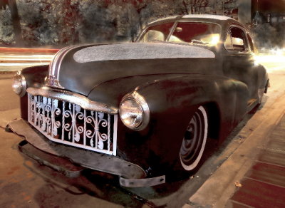
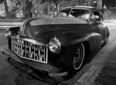
billinchapelhill wrote:This shot is a big favorite of mine right now and I thought it would be quite popular but not so far. Due to the long night time exposure under heavy yeloow street lighting, the original was heavily monochrome and dominated by dull yellows. So I did much more color correction and painting than is my norm. The result is that the PP is much more obvious and I ask you if you feel that it is too much.


Bill, you saw that some feel they preferred the original because it
was rawer (I did too and like it the way it was). But you expressed
that the original wasn't acceptable to you for the reasons given. Then
you asked us if the PP on the first one was too much and how we felt.

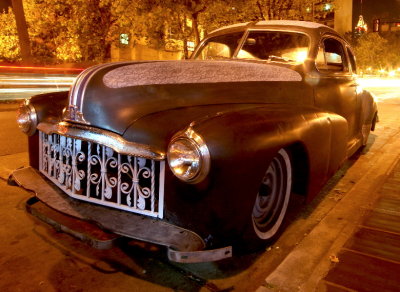
I've since visited your galleries to see that the color-corrected version
you made is very popular actually, so I was a little confused until I saw
that half of the positive feedback was after posting this thread. But the
comments before that were rightfully =very positive because it
SO fits your theme of Twilight Zone in which things should look a bit
out of the ordinary and was very striking with that in mind. No
reality-rawness was needed or wanted there.

Then you wrote:
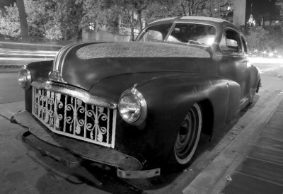
billinchapelhill wrote:Per the last 2 posts, here it is in mono with minimal pp work. For sure this is a pretty simple way of dealing with the exposure and sodium lighting issues, and presented this way it does not turn off the viewer that has those kind of viewing pre-requisites.

I like it quite well in mono but it brings the image closer to normal and for me sacrifices the uniqueness of the bizarre lighting coloring. If I was more patient and skilled at touch up, I think the colored verzion would grab more of those so disposed.


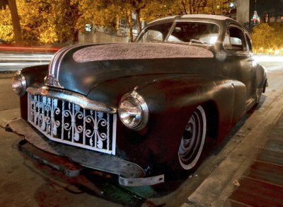
As a result of what you wrote, I did a social boo-boo. I had participated
in Jim Critchley's thread asking for people to submit their own solutions
if someone was having problems with a picture rather than just do text
responses.
http://forum.pbase.com/viewtopic.php?t=31107

But that was in the Technical thread, not here in Artistic
(I got the topic area wrong), so apologies for deciding to try what Jim
had requested but didn't get much activity on -- people here submitting
alternative post-processing rather than just agreeing something didn't
work.

In my case, it's in a non-public gallery and accessible only through this
forum and thread.

I hope I haven't offended you.

PostPosted: Fri Jun 22, 2007 9:30 pm
by billinchapelhill
Andrys
No I am not offended because what you did was in context with my post and the thread content. I have done the same in the past after getting permission first from the photographer. So I suggest that etiiquette to you and others as well.

In your temp gallery, the first images hold together the best for me but the latter ones all are increasingly problematic because of the increasing noise (not sure if this is the right term) in the left front fender. The last image has the most thumbnail appeal and the most fender noise.

My knowledge of PP tools is quite lacking. I have no idea what LAB mode and Lightness are. I still use the free MGI PhotoSuite IV tool that I got years ago as my high end PP'er. Someday I will upgrade.

My comment about not being "quite popular" is relative to the popular photos page where this image did not take off as I thought it might at the time.

Thanks to all for commenting and I hope to see more collaborative threads coming to life in this forum.

Bill

PostPosted: Fri Jun 22, 2007 9:58 pm
by andrys
billinchapelhill wrote:Andrys
No I am not offended because what you did was in context with my post and the thread content. I have done the same in the past after getting permission first from the photographer. So I suggest that etiiquette to you and others as well.


Sure. I just had in mind Jim's mild disappointment when people didn't
join in his thread with other pp tries and I'd felt bad about that and
thought this was a better thread for it since you'd not been happy
with the color shot but wanted the color lighting if you had time.
So I thought I'd try one.
Wrong topic though!

In your temp gallery, the first images hold together the best for me but the latter ones all are increasingly problematic because of the increasing noise (not sure if this is the right term) in the left front fender. The last image has the most thumbnail appeal and the most fender noise.


I actually shadow-highlighted that fender noise because I liked it.
Seemed to have character, but probably wasn't showing in real life then.

I did copies with a totally dark fender and didn't like it as much.
I think because bringing up the fender paint flaw gave a rawer aspect
of the car. If you want that with a dark fender in b&w, let me know.

My knowledge of PP tools is quite lacking. I have no idea what LAB mode and Lightness are. I still use the free MGI PhotoSuite IV tool that I got years ago as my high end PP'er. Someday I will upgrade.


From a look at your galleries, it seems it's been more than enough though!

My comment about not being "quite popular" is relative to the popular photos page where this image did not take off as I thought it might at the time.


Oh! Ok. That depends on voting then. Well, people seeing your copy
made for Twilight Zone seemed delighted by it, nevertheless.

Thanks to all for commenting and I hope to see more collaborative threads coming to life in this forum.


With permission! :-)

Thanks.