Board index Photography Artistic Questions Colour or (toned) monochrome?

Artistic Questions

Colour or (toned) monochrome?

Discuss style and artistic aspects of photography
ernst
 
Posts: 537
Location: Maastricht, Netherlands

Colour or (toned) monochrome?

Post Sun Jan 14, 2007 11:37 am


Looking for critique!
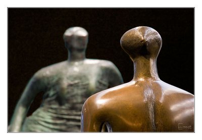
I took this photo and I like the contrast between the polished bronze and the green patina of the two statues. But then I decided to try a black&white (monochrome, one can hardly call this a B+W, can they?). Now I am not so sure anymore...

Which do you prefer and why? Would you have done something different?

Image Image
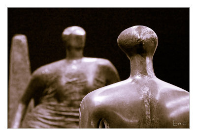
(Click images for original size)

You're invited to post your treatment in this thread, I have the original available for download here: http://www.pbase.com/ernst/image/73038723

Looking forward to your reaction.

jdepould
 
Posts: 540


Post Sun Jan 14, 2007 1:46 pm


B&W (or in this case sepia) is almost always more interesting than color, especially when the background is a bright color and the actual subjects are less vivid.
Nikon D300, D200
Nikkor 50mm f/1.8D, 55mm f/1.4 micro, 18-70mm f/3.5-4.5G DX, 80-200 f/2.8D
Apple PowerBook G4, MacBook Pro
Adobe Lightroom, Photoshop CS3

lord_of_the_badgers
 
Posts: 440


Post Sun Jan 14, 2007 10:01 pm


Actually I think in this case the colour image is more interesting - it retains contrast so that you have a greater sense of depth - and the colours are nice.

you could try desaturating the colour one a little, so it retains some colour

Speaking as someone who's doing quite a bit of duotone/tinted stuff lately... :)

ernst
 
Posts: 537
Location: Maastricht, Netherlands


Post Sun Jan 14, 2007 11:10 pm


Thanks, that's one all. :lol:

Any other opinions?

michaelsv
 
Posts: 802


Post Mon Jan 15, 2007 12:06 am


What do you think of selective color? IMO, the background and distant figure are definitely more interesting in monochrome version. But I will try to leave the foreground figure with the color..., may b a bit less saturated.

My 2c

Michael.

rickl52
 
Posts: 239


Post Mon Jan 15, 2007 3:06 pm


The color version is more pleasing to my eye. It has depth and a dimensional contrast that isolates the near figure's focus nicely. The background color is complimentary to that of the near figure. The monochrome image loses most of the depth and the black background becomes visually "heavy".

jypsee
 
Posts: 1247

both work for me

Post Mon Jan 15, 2007 3:20 pm


in different ways. I like the separation apparent in the color version. I like the "shapes" abstraction apparent in the sepia version, though I'd clone out the obelisk-like thing behind the background figure.

lord_of_the_badgers
 
Posts: 440

Re: both work for me

Post Mon Jan 15, 2007 5:06 pm


jypsee wrote:in different ways. I like the separation apparent in the color version. I like the "shapes" abstraction apparent in the sepia version, though I'd clone out the obelisk-like thing behind the background figure.


good point about the obelisk thingy.. didn't think about that. it is indeed somewhat unnecessary to the composition...

ernst
 
Posts: 537
Location: Maastricht, Netherlands


Post Tue Jan 16, 2007 7:37 am


Thanks all for your suggestions!
During the next weekend, when I have access to photoshop again, I'll try some of the options, like selective colour and cloning-out. However, the obelisk-like object is part of the back sculpture, so I am a little hesitant in that...

I'll post the results.
Thanks.

blachly
 
Posts: 131


Post Tue Jan 16, 2007 7:21 pm


I like the color one but the background annoys me. I would try to adjust it to a be less intrusive.

artandrevolution
 
Posts: 236


Post Thu Jan 18, 2007 9:36 pm


sepia toned. hands down. the color is annoying.
"The role of the revolutionary artist is to make revolution irresistable"

jude_53
 
Posts: 383


Post Fri Jan 19, 2007 9:54 pm


I agree that they both are good for different reasons. But I like the pillar thing, especially in the monochrome. It almost looks like an angel wing - having to do with the figure it is next to.. I don't find it distacting at all.
My favorite? I have to go with the color...

clickaway
 
Posts: 2689


Post Sat Jan 20, 2007 8:51 pm


I have to disagree with Jude!

I would prefer the mono if it weren't for the obelisk thing behind. But it doesn't distract so much in the colour version because of the rich colour background.

Looking forward to your new options.

Ray

philway
 
Posts: 36


Post Tue Jan 23, 2007 6:24 pm


My interpretation

Image

ernst
 
Posts: 537
Location: Maastricht, Netherlands

Sorry, it took a while...

Post Thu Feb 08, 2007 9:24 pm


... my new study is more demanding than anticipated.

Again, I thank you all for your suggestions. I tried several and the results are here (click photo for original size):
Image
First, I hesitated cloning out the obelisk, because it is part of the back statue, but you were right, it is an improvement!

Image
Keeping the natural colour for the front statue introduces some weird coloured reflections (not noticeable in the small versions).

Image
Giving them both back their own colours works well.

So, in the end I think I still prefer the monochrome, but without the obelisk. :D

Philway, I'm afraid your approach is a bit too much for me, yet. Cool effect though 8) , I am surprised however how some details emerge in the structure. I like your idea to do something really radical. Maybe I'll give it a go in the future. Thanks for posting and if you have more, please post.

Next

Board index Photography Artistic Questions Colour or (toned) monochrome?

Who is online

Users browsing this forum: ClaudeBot and 1 guest