Honorable mentions:
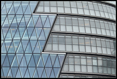
Simple graphic view from Markus Grompe:
Another bold and graphic view, from Yaron Koler:
I am not a central symmetry fan, but this keeps catching my eye from Alla Gilbourd:
What a simple yet beautiful silhoutte from John Medlin:

I don't know what this is, but I like it, from Alain Lastrade:
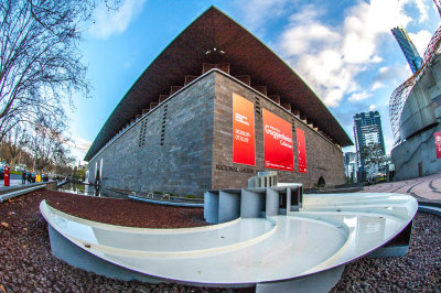
We definitely need a shot of the Sydney Opera House, from Paul Dudley:
Cool distortion from Steve Maz:
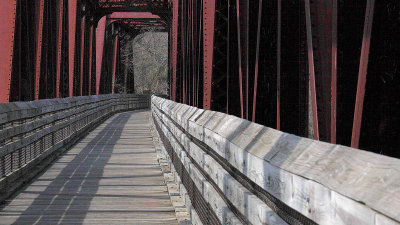
We've taken covered bridge shots, but this has just the right amount of perspective, contrast, and shadows for my taste from Allan Hart:
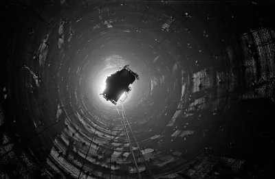
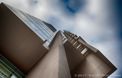
Dizzying perspective from Walter Koenig:
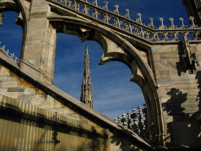
Flying buttresses from Robin Lew. At first glance, kind of busy, but in original the image has flow from point to point:
I like the perspective and structure, but I prefer more contrast, even with the haze. From Gill Kopy:
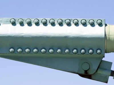
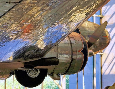
Third Place: The colorful reflections draw my eye to this, and then spending more time I appreciate the craftsmanship of the aluminum skin, the design of the plane, and the nice painting detail on the cowling of the engine. The reflecting colors frame the subject. From Aldeca:
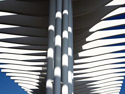
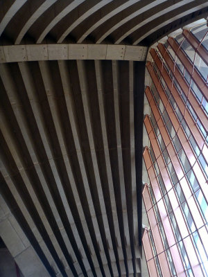
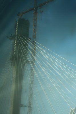
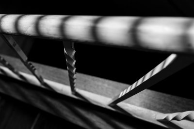
Second Place: The spirals contrasting with the zebra stripe shadows and dramatic perspective kept me looking at this one from Markus Grompe. Best seen at original size:
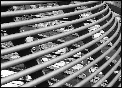
First Place to Tom Sherry: This is a deceptively simple image, but the more I look at it in original size, the more I like it. The tonal range is great, I like the monochrome, and I like the contrast between the simple repeating curves in the foreground versus the diverse structures and opposing curves and lines in the background. Well seen and well rendered.